

Flutter Button Widget and Its Properties
Button in Flutter is the main important component that helps to trigger any event, You can navigate to any other pages on click of a button, or perform any task on click event.
Buttons are the widgets that are provided by the material design library. There are many types of buttons available in the flutter which helps us to make our UI beautiful.
In the flutter, you can provide shapes, styles, color, animation to the button widget
Flutter Buttons
There are some new button widgets available in the flutter. We can say some are deprecated and now we are having some new ones, which are listed below.
- TextButton
- ElevatedButton
- OutlinedButton
TextButton
TextButton is a button that has a labeled child displaying on the Material widget with default 0 elevations. Before it was used as FlatButton but in the latest SDK instead of Flat Button we have to use TextButton. You can use all the properties of TextStyle in this button. Many TextStyle properties are described in the Flutter Text Widget article, I hope you’ve gone through with this article. Use TextButton in toolbars, in dialog, or inline with other content. As it does not have any borders, you need to use it in a container if you want any border for this. You can also customize it by TextButtonTheme, There is one more important property that allows you to handle click event that is *onPressed* and also *onLongPress* property is there.
Let’s understand it by the example below, here we have created three buttons with different styles.
Column(
 mainAxisSize: MainAxisSize.min,
 children: <Widget>[
   TextButton(
     style: TextButton.styleFrom(
       textStyle: const TextStyle(fontSize: 20),
     ),
     onPressed: null,
     child: const Text('Disabled'),
   ),
   const SizedBox(height: 30),
   TextButton(
     style: TextButton.styleFrom(
       textStyle: const TextStyle(fontSize: 20),
     ),
     onPressed: () {},
     child: const Text('Enabled'),
   ),
   const SizedBox(height: 30),
   ClipRRect(
     borderRadius: BorderRadius.circular(4),
     child: Stack(
       children: <Widget>[
         Positioned.fill(
           child: Container(
             decoration: const BoxDecoration(
               gradient: LinearGradient(
                 colors: <Color>[
                   Color(0xFFEA4949),
                   Color(0xFF920606),
                   Color(0xFFF57542),
                 ],
               ),
             ),
           ),
         ),
         TextButton(
           style: TextButton.styleFrom(
             padding: const EdgeInsets.all(16.0),
             primary: Colors.white,
             textStyle: const TextStyle(fontSize: 20),
           ),
           onPressed: () {},
           child: const Text('Gradient'),
         ),
       ],
     ),
   ),
 ],
)
So this is the example of TextButton and below is the output of it

ElevatedButton
Elevated Button is a flutter widget provided by a Material design whose elevation increases when it is pressed. Use it when there is a flat layout, or any kind of list if the layout is already elevated such as card, dialog, etc. so try to skip this.
Using the style parameter you can change the default style of the elevated button.
Same like TextButton it is also having onPressed and onLongPress properties, if you make them null the button will be disabled.
Let’s understand it by below example
import 'package:flutter/material.dart';

void main() => runApp(const MyApp());

class MyApp extends StatelessWidget {
 const MyApp({Key? key}) : super(key: key);

 static const String _title = 'Flutter4u';

 @override
 Widget build(BuildContext context) {
   return MaterialApp(
     title: _title,
     home: Scaffold(
       appBar: AppBar(title: const Text(_title)),
       body: const MyStatefulWidget(),
     ),
   );
 }
}

class MyStatefulWidget extends StatefulWidget {
 const MyStatefulWidget({Key? key}) : super(key: key);

 @override
 State<MyStatefulWidget> createState() => _MyStatefulWidgetState();
}

class _MyStatefulWidgetState extends State<MyStatefulWidget> {
 @override
 Widget build(BuildContext context) {
   final ButtonStyle style = ElevatedButton.styleFrom(
       textStyle: TextStyle(fontSize: 20),
       primary: Colors.black, onPrimary:Colors.red);

   return Center(
     child:

     Column(
       mainAxisSize: MainAxisSize.min,
       children: <Widget>[
         ElevatedButton(
           onPressed: null,
           child: const Text('Disabled'),
         ),
         const SizedBox(height: 30),
         ElevatedButton(
           style: style,
           onPressed: () {},
           child: const Text('Enabled'),
         ),
       ],
     ),
   );
 }
}
Output of this code will be like

OutlinedButton
- A flutter widget which helps us to create outlined buttons, this button is also provided by the Material design library. The button is similar to TextButton but it has an outline border. The most commonly used button nowadays is outline buttons, it was introduced in flutter 1.22.
OutlinedButton having default ButtonStyle.side which helps to define the appearance of outline.
Check the below code for getting more details about the outlinedbutton.
import 'package:flutter/material.dart';
void main() => runApp(const MyApp());
class MyApp extends StatelessWidget {
const MyApp({Key? key}) : super(key: key);
static const String _title = 'Flutter4u';
@override
Widget build(BuildContext context) {
return MaterialApp(
title: _title,
home: Scaffold(
appBar: AppBar(title: const Text(_title)),
body: const Center(
child: MyStatelessWidget(),
),
),
);
}
}
class MyStatelessWidget extends StatelessWidget {
const MyStatelessWidget({Key? key}) : super(key: key);
@override
Widget build(BuildContext context) {
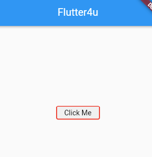
final ButtonStyle style = OutlinedButton.styleFrom(
side: const BorderSide(width: 2, color: Colors.red),primary: Colors.black);
return OutlinedButton(
onPressed: () {
debugPrint('Button clicked');
},
style: style,
child: Text('Click Me'),
);
}
}
Output of this code will be like below image
So guys these are the button widgets in the flutter, I hope you can now create them easily.


