

Date Range Picker in Flutter is a user-friendly and simple package for Flutter that allows users to select a date range. It’s designed to evolve over time, and its components are built to be reusable.
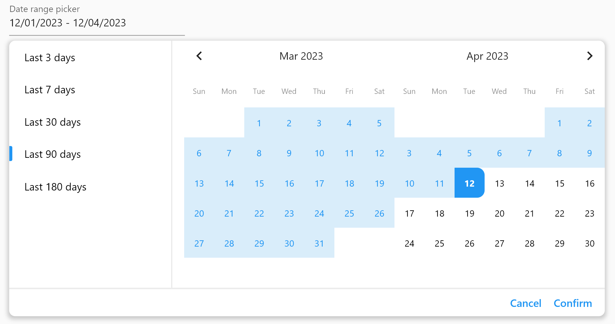
(Isn’t it beautiful?)
Features ✅
- Simple and user-friendly interface
- Customizable theme
- Reusable components
- Field, form field, and dialog widgets
- Functions to display a date range picker as a dialog
- Supports minimum and maximum date limitations
- Displays two months at once for easy navigation
Install Date Range Picker in Flutter 🪛
Add the package to your pubspec.yaml file:
dependencies:
  date_range_picker: ^latest_version
Then, run flutter packages get in your terminal.
Usage 📖
To use the Date Range Picker, simply import the package and create a DateRangePickerWidget:
DateRangePickerWidget(
    doubleMonth: doubleMonth,
    maximumDateRangeLength: 10,
    minimumDateRangeLength: 3,
    initialDateRange: selectedDateRange,
    disabledDates: [DateTime(2023, 11, 20)],
    initialDisplayedDate:
    selectedDateRange?.start ?? DateTime(2023, 11, 20),
    onDateRangeChanged: onDateRangeChanged,
);
You can also use the DateRangeField or DateRangeFormField to display a dialog asking the user to select a date range, and to display the selected range. Here is an example:
DateRangeField(
    decoration: InputDecoration(
        label: Text("Date range picker"),
        hintText: 'Please select a date range',
    ),
    onDateRangeSelected: (DateRange? value) {
    // Handle the selected date range here
    },
  selectedDateRange: selectedRange,
);
Lastly, you can use the showDateRangePickerDialog function to display a dialog asking the user to select a date range:
showDateRangePickerDialog(
    context: context,
    builder: datePickerBuilder
);
...

Widget datePickerBuilder(BuildContext context, dynamic Function(DateRange) onDateRangeChanged) => DateRangePickerWidget(
    doubleMonth: true,
    initialDateRange: selectedDateRange,
    onDateRangeChanged: onDateRangeChanged,
);
Customization 🎨
You can customize the appearance of the Date Range Picker by providing a custom CalendarTheme:
DateRangePickerWidget(
    onDateRangeChanged: (dateRange) {
    // Handle the selected dateRange here
    },
    theme: CalendarTheme(
    selectedColor: Colors.blue,
    dayNameTextStyle: TextStyle(color: Colors.black45, fontSize: 10),
    inRangeColor: Color(0xFFD9EDFA),
    inRangeTextStyle: TextStyle(color: Colors.blue),
    selectedTextStyle: TextStyle(color: Colors.white),
    todayTextStyle: TextStyle(fontWeight: FontWeight.bold),
    defaultTextStyle: TextStyle(color: Colors.black, fontSize: 12),
    radius: 10,
    tileSize: 40,
    disabledTextStyle: TextStyle(color: Colors.grey),
    )
,
);
License 📜
This package is released under the MIT License.
Contributing 🤝
We encourage and welcome contributions from the community to help improve and grow this project. If you would like to contribute, please feel free to fork the repository, make changes, and submit a pull request.
If you have any questions or need guidance, don’t hesitate to reach out to the maintainer of this project. We appreciate your interest and support, and we look forward to collaborating with you!
Learn more about date picker click here
Credit
This project is developed by GaspardMerten
Download this project from the below link.
https://github.com/GaspardMerten/date_range_picker/archive/refs/heads/main.zip
You can visit the source page from the below link:
https://github.com/GaspardMerten/date_range_picker


