

Material Slider and Range Slider for Flutter
flutter_xlider
Note: Now supports null safety.
(Flutter Slider) A material design slider and range slider, horizontal and vertical, with rtl support and lots of options and customizations for flutter
!! Since version 3.4.0-dev.3, step type is no longer double, its FlutterSliderStep !!
Get Started
Single Slider
A single slider
FlutterSlider(
  values: [300],
  max: 500,
  min: 0,
  onDragging: (handlerIndex, lowerValue, upperValue) {
    _lowerValue = lowerValue;
    _upperValue = upperValue;
    setState(() {});
  },
)

To make slider Right To Left use rtl: true
FlutterSlider(
  ...
  rtl: true,
  ...
)

Range Slider
A simple example of range slider
FlutterSlider(
  values: [30, 420],
  rangeSlider: true,
  max: 500,
  min: 0,
  onDragging: (handlerIndex, lowerValue, upperValue) {
    _lowerValue = lowerValue;
    _upperValue = upperValue;
    setState(() {});
  },
)

Vertical Axis
You can change the axis of your slider by setting axis to Axis.vertical. Default is horizontal
FlutterSlider(
  ...
  axis: Axis.vertical,
  ...
)


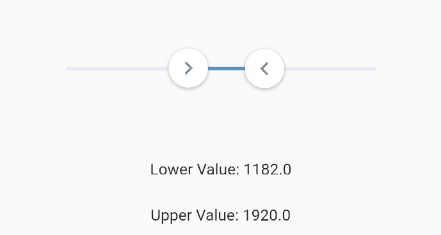
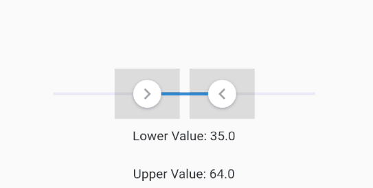
Handlers
You can customize handlers using handler and rightHandler properties.
Both handler and rightHandler accept FlutterSliderHandler class which has following properties:
child: is a widgetdisabled: to disable the handlerdecoration,foregroundDecorationandtransformare come fromContainer()widget
FlutterSlider(
  ...
  handler: FlutterSliderHandler(
    decoration: BoxDecoration(),
    child: Material(
      type: MaterialType.canvas,
      color: Colors.orange,
      elevation: 3,
      child: Container(
          padding: EdgeInsets.all(5),
          child: Icon(Icons.adjust, size: 25,)),
    ),
  ),
  rightHandler: FlutterSliderHandler(
    child: Icon(Icons.chevron_left, color: Colors.red, size: 24,),
  ),
  ...
)
Handler Scale Animation
You can control the scale animation type of your handlers, it’s duration and it’s scale size using handlerAnimationhandlerAnimation accepts a FlutterSliderHandlerAnimation class which has 4 properties as following
FlutterSlider(
  ...
    handlerAnimation: FlutterSliderHandlerAnimation(
      curve: Curves.elasticOut,
      reverseCurve: Curves.bounceIn,
      duration: Duration(milliseconds: 500),
      scale: 1.5
    ),
  ...
)

if you don’t want scale animation, then just pass 1 to scale property
if you don’t want reverseCurve, just ignore it. default is null
Trackbars
To customize track bars you can use FlutterSliderTrackBar. You can see the details here
FlutterSlider(
  ...
    trackBar: FlutterSliderTrackBar(
      activeTrackBarHeight: 5,
    ),
  ...
)
inactiveTrackBarColor and activeTrackBarColor properties are removed. use inactiveTrackBar and activeTrackBar instead.
FlutterSlider(
  ...
    trackBar: FlutterSliderTrackBar(
      inactiveTrackBar: BoxDecoration(
        borderRadius: BorderRadius.circular(20),
        color: Colors.black12,
        border: Border.all(width: 3, color: Colors.blue),
      ),
      activeTrackBar: BoxDecoration(
        borderRadius: BorderRadius.circular(4),
        color: Colors.blue.withOpacity(0.5)
      ),
    ),
  ...
)

Central Widget
If you want to have a widget in the middle of your slider, you can use centralWidget
FlutterSlider(
  ...
    trackBar: FlutterSliderTrackBar(
        centralWidget: Container(
          decoration: BoxDecoration(
              color: trackBarColor,
            borderRadius: BorderRadius.circular(50)
          ),
          width: 9,
          height: 9,
        ),
    ),
  ...
)
Tooltips
In order to customize your tooltips, you can use FlutterSliderTooltip class. You can see all properties here
FlutterSlider(
  ...
  tooltip: FlutterSliderTooltip(
    textStyle: TextStyle(fontSize: 17, color: Colors.white),
    boxStyle: FlutterSliderTooltipBox(
      decoration: BoxDecoration(
        color: Colors.redAccent.withOpacity(0.7)
      )
    )
  ),
  ...
)
Here there is a range slider with customized handlers, trackbars and tooltips

Tooltip Prefix
You can use leftPrefix, leftSuffix, rightPrefix, rightSuffix to add your desired widget around tooltip content.
FlutterSlider(
  ...
    tooltip: FlutterSliderTooltip(
      leftPrefix: Icon(Icons.attach_money, size: 19, color: Colors.black45,),
      rightSuffix: Icon(Icons.attach_money, size: 19, color: Colors.black45,),
    ),
  ...
)

Tooltip Format
If you want to change the format of the value of tooltip you can use format method.
FlutterSlider(
  ...
    tooltip: FlutterSliderTooltip(
      format: (String value) {
        return value + ' ! ';
      }
    ),
  ...
)
Tooltip Callback
If you want to fully change tooltip widget and use your own customized widget, you can use custom function.
FlutterSlider(
  ...
    tooltip: FlutterSliderTooltip(
      custom: (value) {
        return Text(value.toString());
      }
    ),
  ...
)
Disable Tooltip
To disable tooltips, use disabled in FlutterSliderTooltip class
FlutterSlider(
  ...
    tooltip: FlutterSliderTooltip(
      disabled: true,
    ),
  ...
)
Tooltip Direction
To change the direction of the tooltip, you can use direction
FlutterSlider(
  ...
    tooltip: FlutterSliderTooltip(
      direction: FlutterSliderTooltipDirection.right,
    ),
  ...
)
Tooltip Position Offset
By default tooltip alignment is center, but you can modify it’s top, left, right and bottom by using positionOffset
FlutterSlider(
  ...
    tooltip: FlutterSliderTooltip(
      positionOffset: FlutterSliderTooltipPositionOffset(
        top: -100
      ),
    ),
  ...
)
Always Show Tooltips
Tooltips always displayed if this property is set to true.
FlutterSlider(
  ...
  tooltip: FlutterSliderTooltip(
    alwaysShowTooltip: true,
  ),
  ...
)
Controls
Handlers width and height
By default both handlers size are 35 width and height, but you can change this by handlerWidth and handlerHeight
FlutterSlider(
  ...
  handlerWidth: 30,
  handlerHeight: 30,
  ...
)
Select By Tap
You can tap on the slider to select it’s value.
if slider is range-slider, then the closest handler to the selected point will move to that point
FlutterSlider(
  ...
  selectByTap: true, // default is true
  ...
)
if you want to move your handlers by touching and moving active TrackBar, you have to set this to false
Jump
By default slider handlers move fluently, if you set jump to true, handlers will jump between intervals
FlutterSlider(
  ...
  jump: true,
  ...
)
Step
The amount the slider changes on movement can be set using step option
FlutterSlider(
  ...
  step: FlutterSliderStep(step: 1),
  ...
)
Range Step
If you want to have a non-linear slider with different steps, simply use rangeStep feature.
FlutterSlider(
  min: 0,
  max: 1000000,
  ...
  step: FlutterSliderStep(
    step: 1, // default
    isPercentRange: true, // ranges are percents, 0% to 20% and so on... . default is true
    rangeList: [
      FlutterSliderRangeStep(from: 0, to: 20, step: 10000),
      FlutterSliderRangeStep(from: 20, to: 100, step: 200000),
    ]
  ),
  ...
)

Ignore Steps
If your configurations requires that some steps are not available, you can use ignoreSteps property.
this property accepts a simple class to define from and to ranges.
FlutterSlider(
  ...
    ignoreSteps: [
      FlutterSliderIgnoreSteps(from: 8000, to: 12000),
      FlutterSliderIgnoreSteps(from: 18000, to: 22000),
    ],
  ...
)

Fixed Values
If you want to have an array of fixed items and slide through it, you can use fixedValues property. use FlutterSliderFixedValue to add your fixed values.FlutterSliderFixedValue has following properties:
percent: (int) ( between 0..100 inclusive). the position of fixed itemvalue: (dynamic) the value of fixed item
- when using
fixedValues, values ofvaluesproperty, must be within 0..100
FlutterSlider(
  ...
    values: [ 10, 50 ],
    fixedValues: [
      FlutterSliderFixedValue(percent: 0, value: "1000"),
      FlutterSliderFixedValue(percent: 10, value: "10K"),
      FlutterSliderFixedValue(percent: 50, value: 50000),
      FlutterSliderFixedValue(percent: 80, value: "80M"),
      FlutterSliderFixedValue(percent: 100, value: "100B"),
    ],
  ...
)
using above example, you get (string) 10K as upperValue or lowerValue (depends on handler), when you reach to 10 percent of the slider, you get (int) 50000 when you reach 50 percent of the slider and so on…
when using fixedValues, min and max are ignored

Minimum Distance
When using range slider, the minimum distance between two handlers can be defined using minimumDistance option
FlutterSlider(
  ...
    minimumDistance: 300,
  ...
)

Maximum Distance
This is the opposite of minimum distance, when using range slider, the maximum distance between two handlers can be defined using maximumDistance option
FlutterSlider(
  ...
    maximumDistance: 300,
  ...
)

Locked Handlers
If you want to lock your handlers by a certain value, you can use lockHandlers and lockDistance properties
FlutterSlider(
  ...
    lockHandlers: true,
    lockDistance: 50,
  ...
)

Hatch Mark
You can display a Hatch Mark underneath or beside of your slider based on axis. In order to display hatch mark you must
use FlutterSliderHatchMark class which has following properties:
linesDistanceFromTrackBar: The distance of lines from slider. can be negativebigLine: The widget of big lines in hatch marksmallLine: The widget of small lines in hatch marklinesAlignment: the direct of lines,rightorleftwhich works astoporbottomon horizontal sliderdensity: The amount of lines per percent. 1 is default. any number less or more than 1 will decrease and increase lines respectivelydisplayLines: to display lines. by default isfalsefor the sake of optimizationlabels: If you want to display some label or text at certain percent in your hatch mark, you can uselabelslabelBox: The widget of label box, however, you can define a widget for each label and have it’s own stylelabelsDistanceFromTrackBar: The distance of labels from slider. can be negativedisabled: to disabled the whole hatchmark ( hide )
labels alignment is center
Here is an example:
FlutterSlider(
  ...
    hatchMark: FlutterSliderHatchMark(
       density: 0.5, // means 50 lines, from 0 to 100 percent
       labels: [
         FlutterSliderHatchMarkLabel(percent: 0, label: Text('Start')),
         FlutterSliderHatchMarkLabel(percent: 10, label: Text('10,000')),
         FlutterSliderHatchMarkLabel(percent: 50, label: Text('50 %')),
         FlutterSliderHatchMarkLabel(percent: 80, label: Text('80,000')),
         FlutterSliderHatchMarkLabel(percent: 100, label: Text('Finish')),
       ],
     ),
  ...
)

Centered Origin
If you want the value of your slider originates from center of the slider, then you can use centeredOrigin property
FlutterSlider(
  ...
    centeredOrigin: true
  ...

  ...
    trackBar: FlutterSliderTrackBar(
      activeTrackBar: BoxDecoration(color: trackBarColor)
    ),
  ...

  ...
    onDragging: (handlerIndex, lowerValue, upperValue) {
        if (lowerValue > (max - min) / 2) {
          trackBarColor = Colors.blueAccent;
        } else {
          trackBarColor = Colors.redAccent;
        }
        setState(() {});
    })
  ...
)

Touch Size
You can control how big a handler’s touch area could be. by default touch size is 25 The range is between 5 to 50
FlutterSlider(
  ...
  touchSize: 25,
  ...
)
To see the touchable area for handlers, set visibleTouchArea to true and test your slider
FlutterSlider(
  ...
  visibleTouchArea: true,
  ...
)
Disabled
to disable your slider, you can use disabled.
FlutterSlider(
  ...
  disabled: true,
  ...
)
RTL
makes the slider Right To Left
FlutterSlider(
  ...
  rtl: true,
  ...
)
Events
There are 3 events
onDragStarted: fires when drag startsonDragCompleted fires when drag endsonDragging keeps firing when dragging
All three of above functions returns three values.
(int handlerIndex, dynamic lowerValue, dynamic upperValue)
First value is handlerIndex, which determines the handler. 0 is Left Handler and 1 refers to Right Handler
FlutterSlider(
  ...
  onDragging: (handlerIndex, lowerValue, upperValue) {
    _lowerValue = lowerValue;
    _upperValue = upperValue;

    if(handlerIndex == 0)
        print(" Left handler ");

    setState(() {});
  },
  ...
)
Working with Dates
Working with dates are simple and straightforward. just pass standard unix timestamp as values like so:
FlutterSlider(
  ...
  values: [
    new DateTime(2019,6,1,0,0,0).millisecondsSinceEpoch.toDouble(), // lower date : 2019-06-01
    new DateTime(2019,9,1,0,0,0).millisecondsSinceEpoch.toDouble(), // upper date : 2019-09-01
  ],
  min: new DateTime(2019,1,1,0,0,0).millisecondsSinceEpoch.toDouble(), // start date : 2019-01-01
  max: new DateTime(2020,1,1,0,0,0).millisecondsSinceEpoch.toDouble(), // finish date : 2020-01-01
  step: FlutterSliderStep(step: 86400), // 1 day
  ...

  ...
  tooltip: FlutterSliderTooltip(
    custom: (value) {
      DateTime dtValue = DateTime.fromMillisecondsSinceEpoch(value.toInt());
      String valueInTime = dtValue.year.toString() + '-' + dtValue.month.toString() + '-' + dtValue.day.toString();

      return Text( valueInTime );
    }
  )
  ...

)

Showcase
It’s exciting to see what you’ve build using this package.
Open wiki tab, create a page and share your code and image of your slider with us. Thank you
Here are some examples of what you can make using this package:


Credit
This is developed by Ali-Azmoud
Download this project from the below link.
https://github.com/Ali-Azmoud/flutter_xlider/archive/refs/heads/master.zip
You can visit original source page from the below link:
https://github.com/Ali-Azmoud/flutter_xlider


